Defining Charts
To visualize results and make analysis about your model, you will certainly have to use charts. You can define several types of charts in GAML among histograms, pie, series, radar, heatmap... For each type, you will have to determine the data you want to highlight.
Index
Define a chart
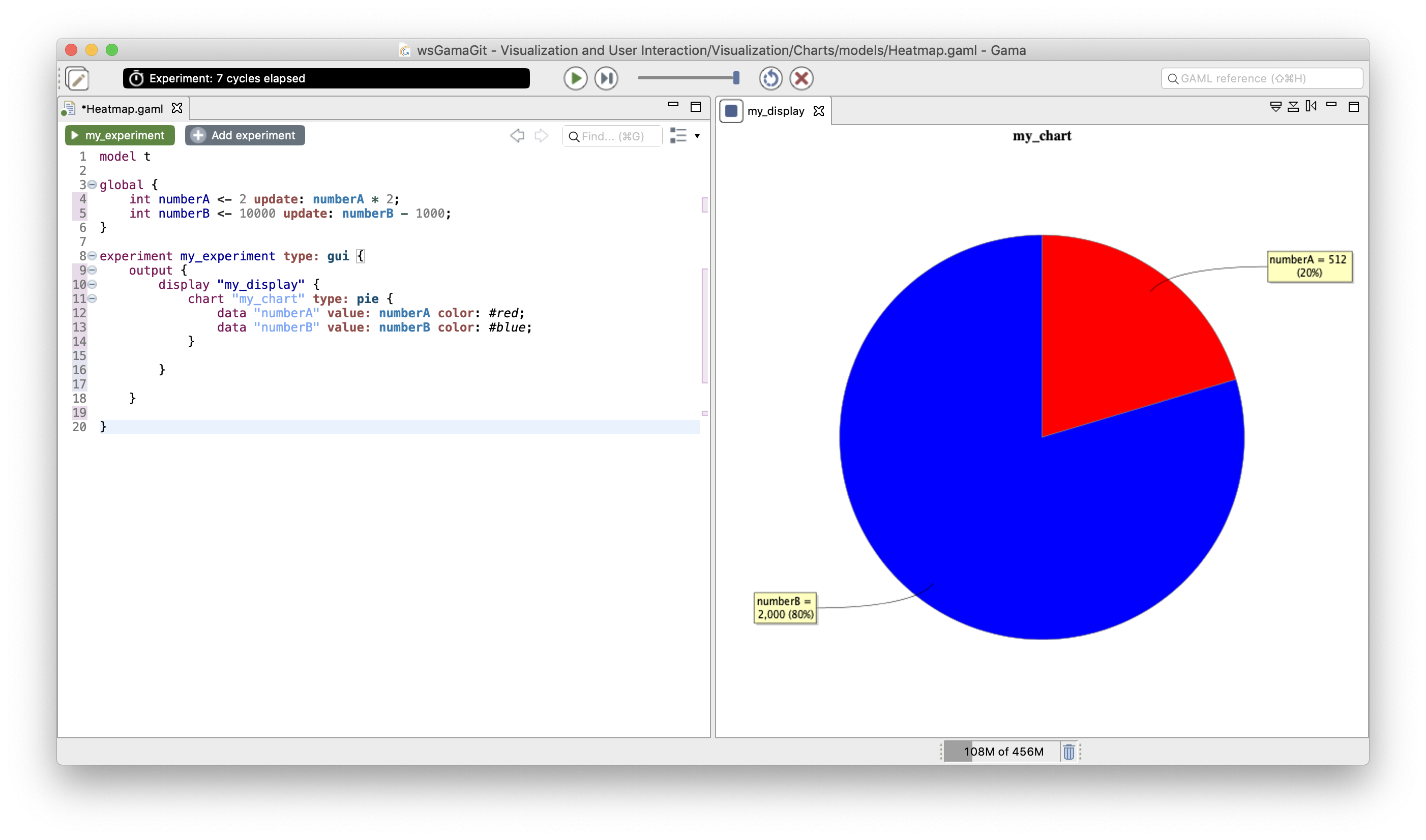
To define a chart, we have to use the chart statement. A chart has to be named (with the name facet), and the type has to be specified (with the type facet). The value of the type facet can be histogram, pie, series, scatter, xy, radar, heatmap or box_whisker. A chart has to be defined inside a display.
experiment my_experiment type: gui {
    output {
	display "my_display" {
	    chart "my_chart" type:pie {

            }
	}
    }
}
chart can be configured by setting by facets: in particular the labels in x and y-axis can be set (x_serie_labels, y_serie_labels), axes colors (axes), a third axis can be added...
After declaring your chart, you have to define the data you want to display in your chart.
Data definition
Data can be specified with:
- several
datastatements to specify each series. - one
dataliststatement to give a list of series. It can be useful if the number of series is unknown, variable or too high.
The data statement is used to specify which expression will be displayed. You have to give your data a name (that will be displayed in your chart), the value of the expression you want to follow (using the value facet). You can add some optional facets such as color to specify the color of your data.
global {
int numberA <- 2 update: numberA*2;
int numberB <- 10000 update: numberB-1000;
}
experiment my_experiment type: gui {
float minimum_cycle_duration <- 0.1;
output {
display "my_display" {
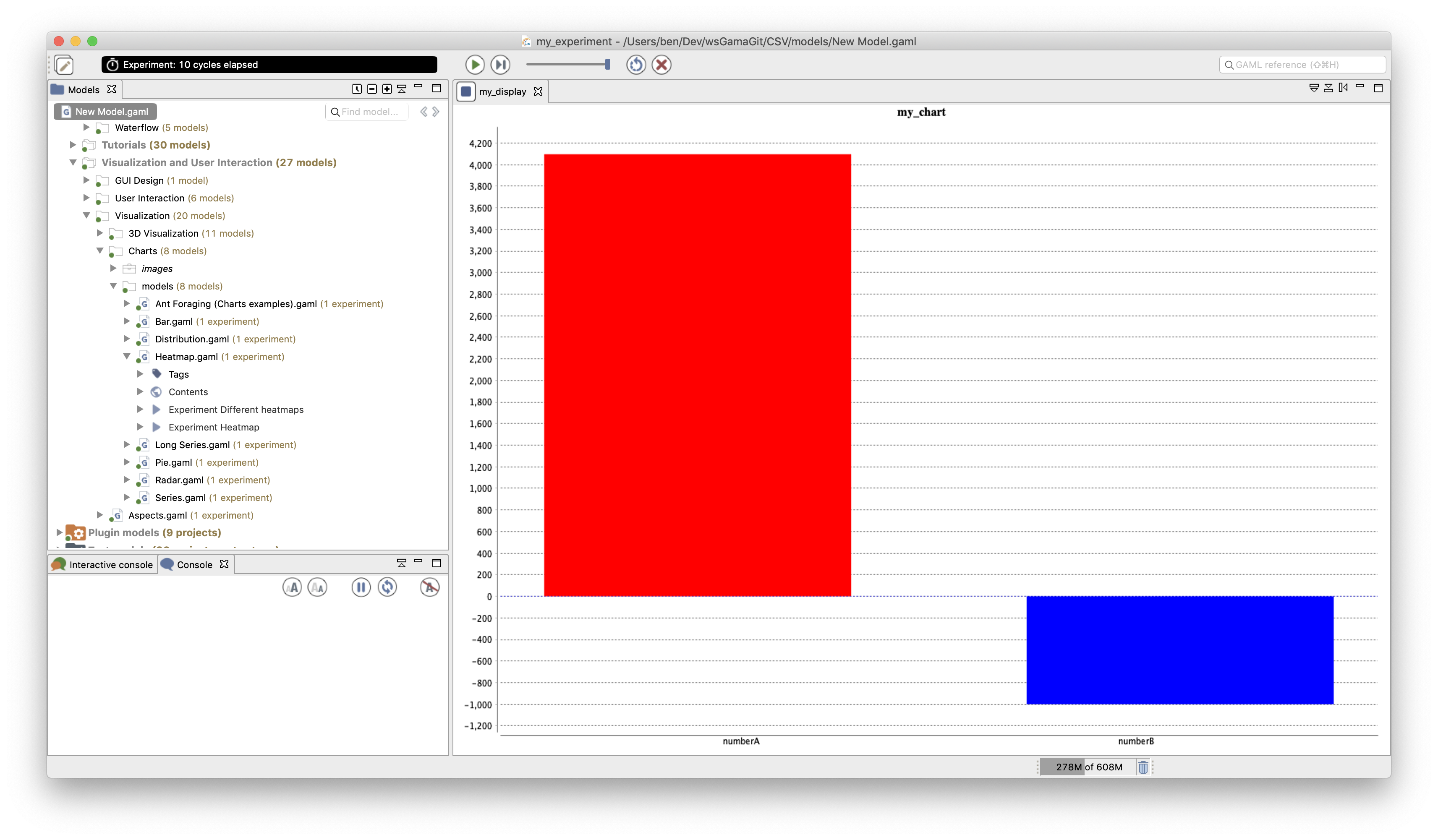
chart "my_chart" type: pie {
data "numberA" value: numberA color: #red;
data "numberB" value: numberB color: #blue;
}
}
}
}
The datalist statement is used to write several data statements in one statement. Instead of giving simple values, datalist is expecting value lists. The previous chart is thus equivalent to the following one using the datalist statement:
display "my_display2" {
    chart "my_chart2" type: pie {
	datalist ["numberA","numberB"] value:  [numberA,numberB] color: [#red,#blue] ;
    }
}
datalist is particularly suitable in the case where the number of data series to plot can change during the simulation. As an example, when we want to plot the evolution of an attribute value for each agent (and new agents are created), we need to use this statement. As an example, in the following model, we want to plot the energy of each people agent. Each simulation step one agent is created.
global {

    init {
	create people number:15;
    }

    reflex population_growth when: length(people) < 50 {
    	create people number:1;
    }

}

species people {

        int energy 	<- rnd(100) min:0;
	rgb color 	<- rnd_color(255);

	reflex aging {
	    energy <- energy - 3;
	}
}

experiment my_experiment type: gui {
    float minimum_cycle_duration <- 0.1;
    output {
    	display "my_display" {
	   		chart "my_chart" type: series {
				datalist people collect (each.name) value:  people collect (each.energy) color: people collect (each.color) ;
		    }
		}
    }
}
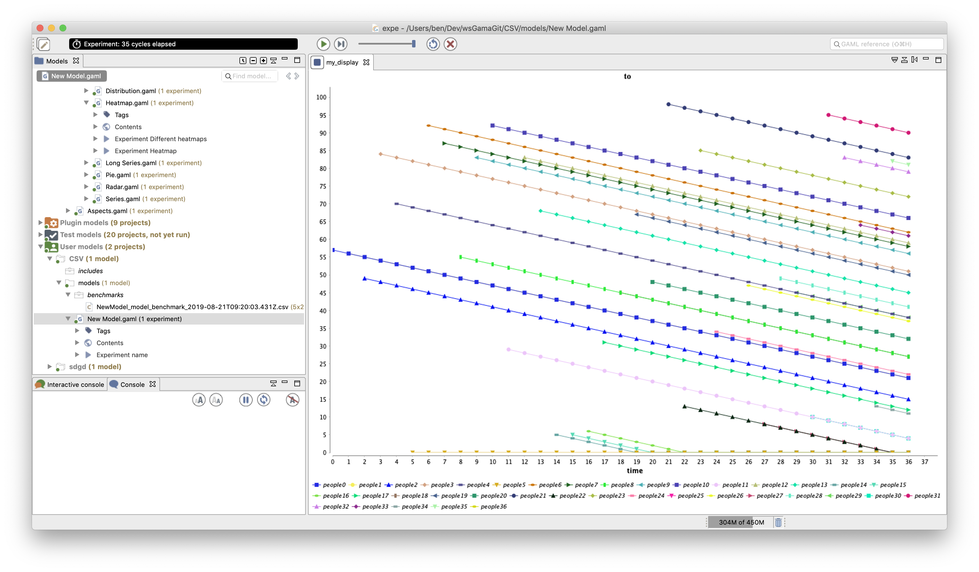
datalist provides you some additional facets you can use. If you want to learn more about them, please read the documentation.
Various types of charts
As we already said, you can display several types of graphs: the histograms, the pies, the series, the radars, heatmap...
pie
The pie chart shows on a single pie diagram the ratio of each data series over the sum of all the series.
It has already been illustrated above.
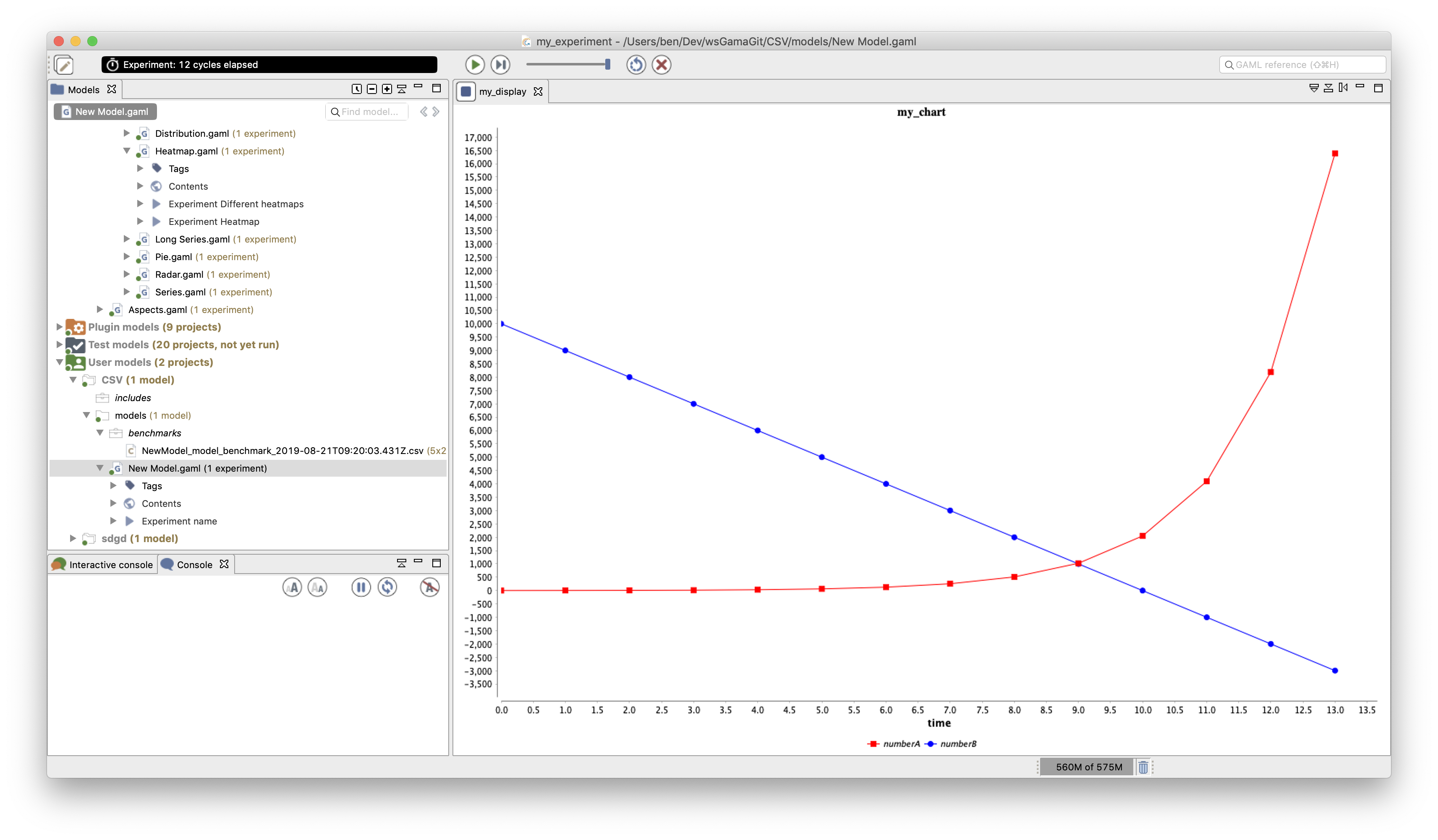
series
The series type is perhaps the most basic plot: it displays in an x-y coordinates space the value of each data series over time (simulation step): the x-axis displays the simulation step, the y-axis represents the value of the data series. The previously defined pie chart, can be displayed using a series simply by changing the chart type.
global {
    int numberA <- 2 update: numberA*2;
    int numberB <- 10000 update: numberB-1000;
}

experiment my_experiment type: gui {
     float minimum_cycle_duration <- 0.1;
     output {
	display "my_display" {
		chart "my_chart" type: series {
			data "numberA" value: numberA color: #red;
			data "numberB" value: numberB color: #blue;
		}
	}
    }
}
histogram
The histogram charts represent with bars the value of several data series. The previous example can be displayed with a histogram chart.
Histograms are often used to display the distribution of a value inside a population. For example, let consider a population of agents representing human beings with an age attribute. The following model illustrates the plot of the age distribution over the population. We used the operator distribution_of to compute the distribution to plot: here we display the number of people agent in 20 ranges computed among the ages between 0 and 100.
model NewModel

global {
    init {
	create people number: 10000;
    }
}

species people {
    float age <- gauss(40.0, 15.0);
}

experiment my_experiment type: gui {
    float minimum_cycle_duration <- 0.1;
    output {
        display "my_display" {
	    chart "my_chart" type: histogram {
		datalist (distribution_of(people collect each.age,20,0,100) at "legend")
		    value:(distribution_of(people collect each.age,20,0,100) at "values");
	    }
	}
    }
}
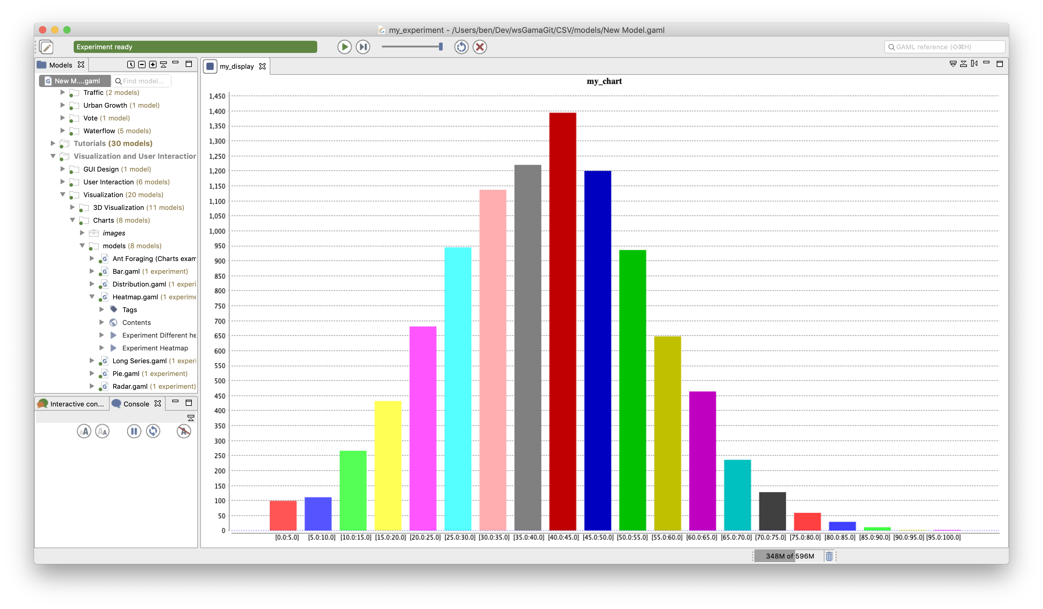
Note that the facet reverse_axes (with true value) can be added to the chart statement to display horizontal bars.
xy
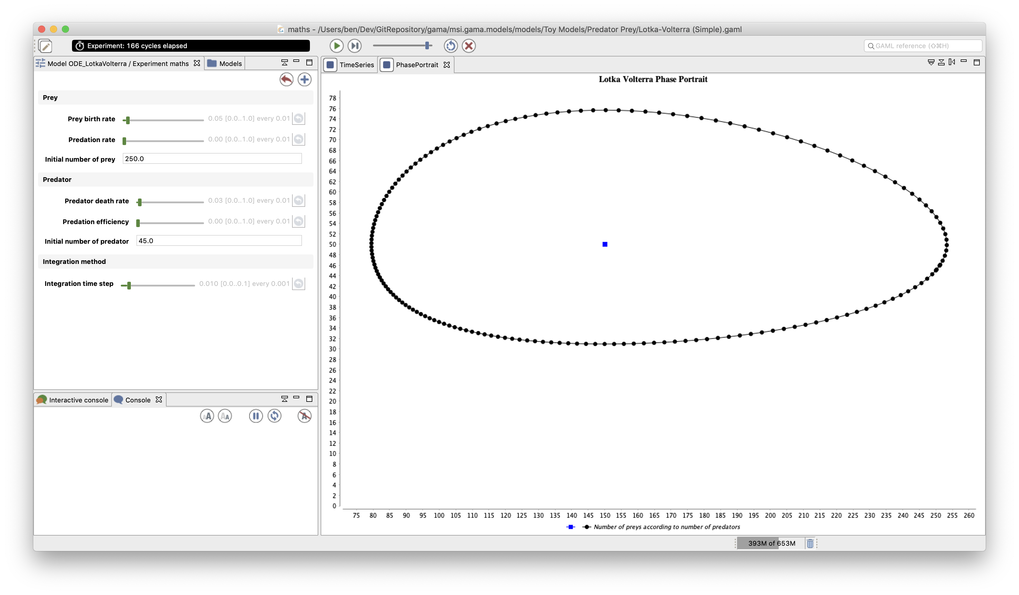
The xy displays are used when we want to display a value in function of another one (instead of plotting a value in function of the time): in this case, the x-axis does not represent the time in general. It can be used for example to plot a phase portrait, e.g. in the Lotka-Volterra model (prey-predator model) in which we want to plot the number of preys according to the number of predators. The code for the chart is then:
display PhasePortrait  {
    chart "Lotka Volterra Phase Portrait" type: xy {
        data 'Preys/Predators' value: {first(LotkaVolterra_agent).nb_prey, first(LotkaVolterra_agent).nb_predator} color: #black ;
    }
}
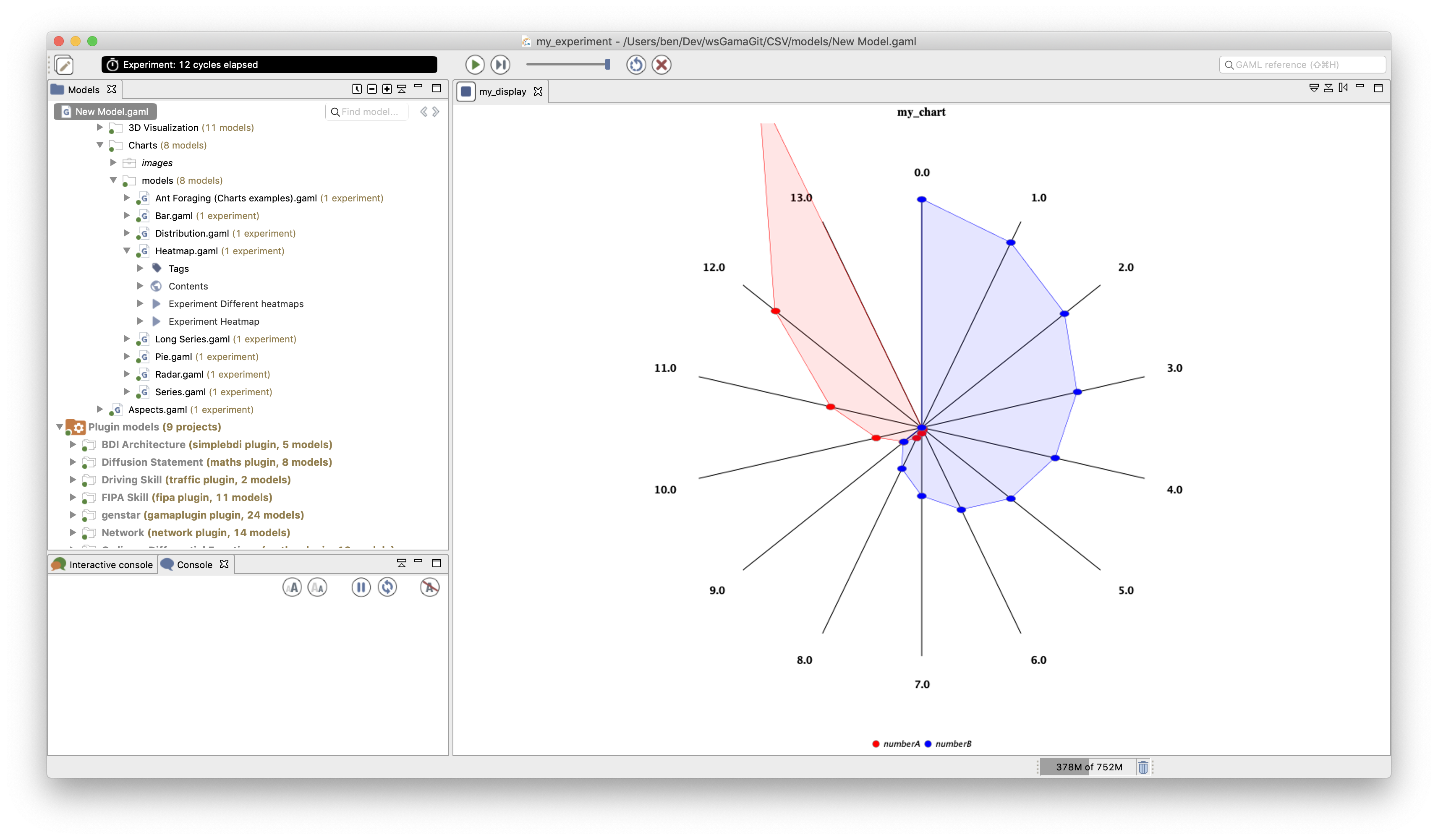
radar
A radar chart displays the evolution of expression over time in a kind of circular representation: the radar representation. If reuse the example describes previously and used in the previous types of charts, we get the following adapted model:
global {
    int numberA <- 2 update: numberA*2;
    int numberB <- 10000 update: numberB-1000;
}

experiment my_experiment type: gui {
    float minimum_cycle_duration <- 0.1;
    output {
	display "my_display" {
	    chart "my_chart" type: radar background: #white axes:#black {
		data "numberA" value: numberA color: #red accumulate_values: true;
		data "numberB" value: numberB color: #blue accumulate_values: true;
	    }
	}
    }
}
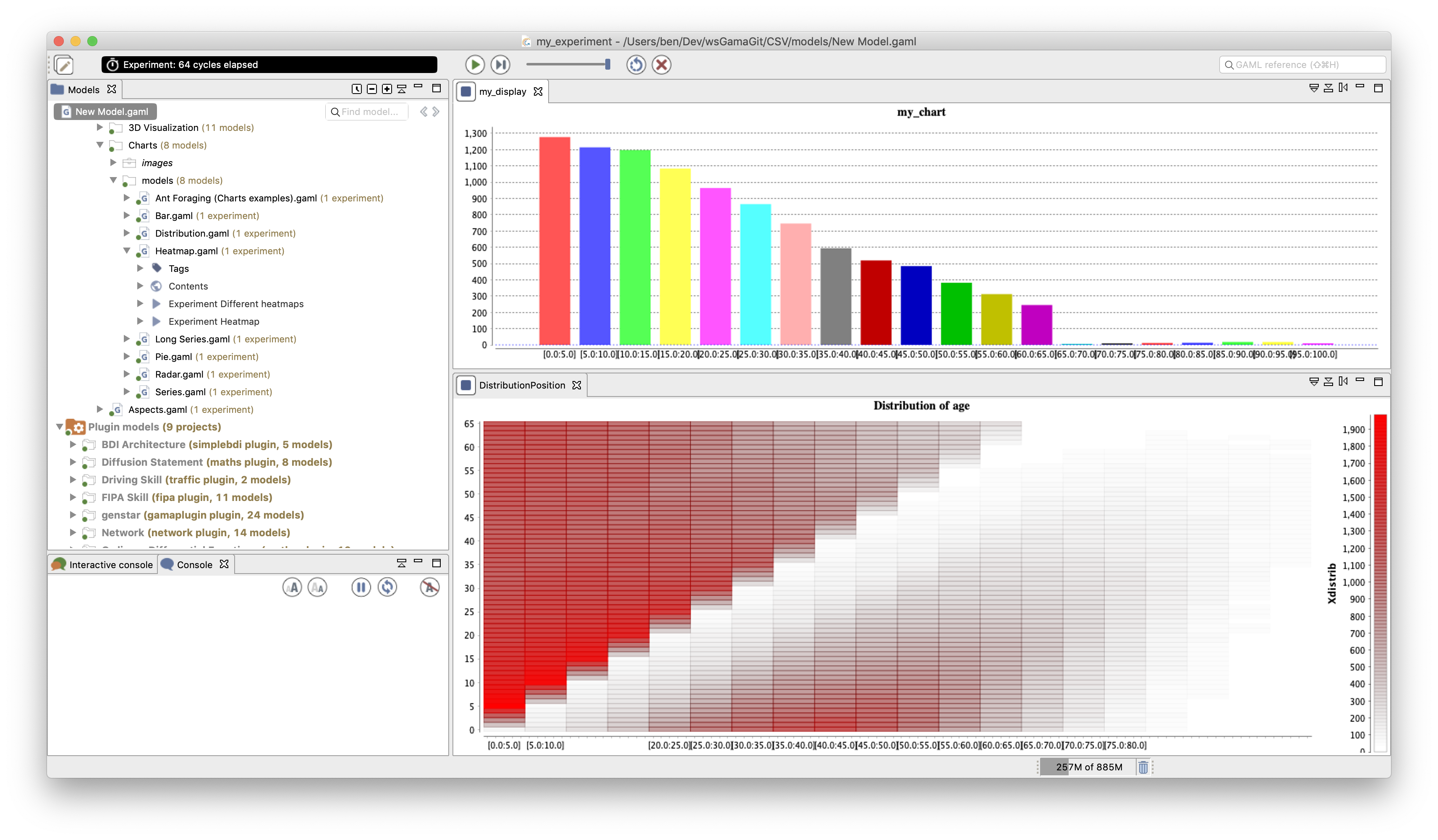
heatmap
The heatmap in GAMA is close to a stack of histograms charts (allowing to keep a view of the evolution of values over time), representing the height of the bars by color in a gradient.
Let consider the model of a human population characterized by their age. We had a population dynamic: at each step, their age is incremented by 1. They also have a probability to die at each step (that increases with their age). When an agent dies, it creates a new agent with an age equals to 0.
model NewModel

global {
    init {
	create people number: 10000;
    }
}

species people {
    float age <- gauss(40.0, 15.0);

    reflex older {
	age <- age + 1;
    }

    reflex die when: flip(age / 1000) {
	create people {
	    age <- 0.0;
	}

	do die;
    }
}

experiment my_experiment type: gui {
    output {
	display "my_display" {
	    chart "my_chart" type: histogram {
		datalist (distribution_of(people collect each.age, 20, 0, 100) at "legend")
                    value: (distribution_of(people collect each.age, 20, 0, 100) at "values");
	    }
	}

	display DistributionPosition {
	    chart "Distribution of age" type: heatmap
                  x_serie_labels: (distribution_of(people collect each.age, 20, 0, 100) at "legend") {
		data "Agedistrib" value: (distribution_of(people collect each.age, 20, 0, 100) at "values") color: #red;
	    }
	}
    }
}
We thus displayed the evolution of the age distribution using both a histogram chart (for the instantaneous distribution) and a heatmap display to key a track of the evolution over time. In the heatmap, the left Y-axis represents the time (the simulation step number); as a consequence 1 line represents the state at 1 simulation step. The x-axis represents the various ranges of the distribution (same meaning as for histograms). The right Y-axis shows the meaning of the color gradient.
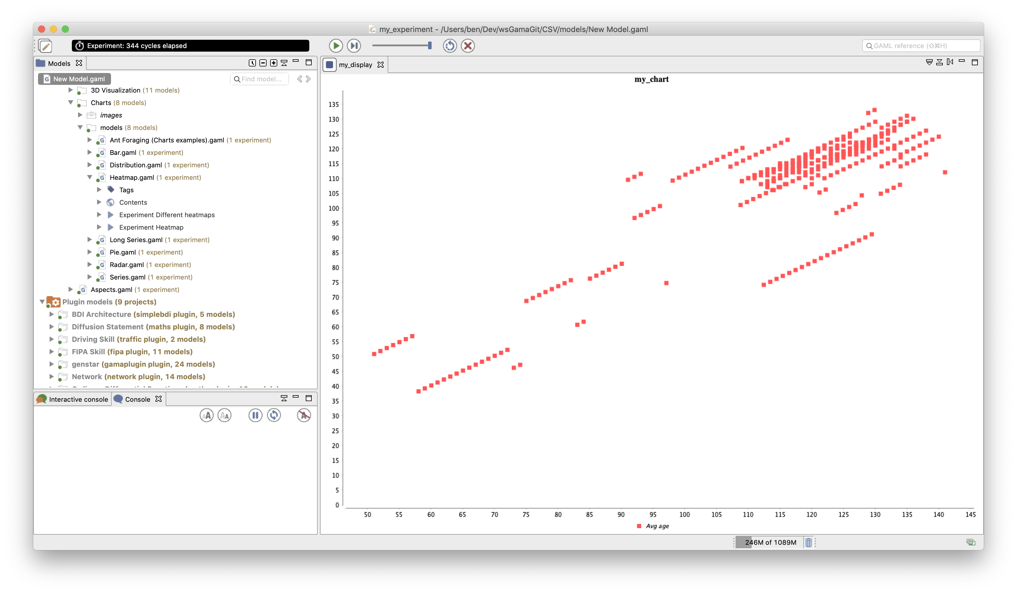
scatter
The scatter chart allows us to represent in a 2D space the "spatial distribution" of a set of values. As an example, it allows us to plot the age of all the people agents: the X-axis represents the possible age value and not the time as in a series charts.
Here is an example of a chart of type scatter on the previous model example:
experiment my_experiment type: gui {
    output {
	display "my_display" {
	    chart "my_chart" type: scatter {
		data "Avg age" value: (people collect each.age) accumulate_values: true line_visible:false ;
	    }
	}
    }
}
box_whisker
The box_whisker charts represent the distribution of a value. A circle for the average, a horizontal line for the median, a filled bar (the "box") for the top 75% and the bottom 25% and a line (the "whisker") for the maximum and minimum values.
For example, let consider again a population of agents representing human beings with an age attribute (with an aging mechanism). The following model illustrates the plot of the age distribution over the population.
model NewModel

global {
    init {
	create people number: 100;
    }
}

species people {
    float age <- gauss(40.0, 15.0);
    reflex older {
	age <- age + 1;
    }

    reflex die when: flip(age / 1000) {
	create people {
	    age <- 0.0;
	}
	do die;
	}
}

experiment my_experiment type: gui {
    float minimum_cycle_duration <- 0.1;
    output {
	display "chart age" {
	    chart "age" type: box_whisker
	    series_label_position:yaxis
	    {
		data "age"
		   value: [mean(people collect each.age),median(people collect each.age),
		   	quantile((people sort_by each.age) collect each.age,0.25),quantile((people sort_by each.age)collect each.age,0.75),
		   	min(people collect each.age),max(people collect each.age)]
		   	color: #green
			accumulate_values: true;
	    }
	  }
    }
}
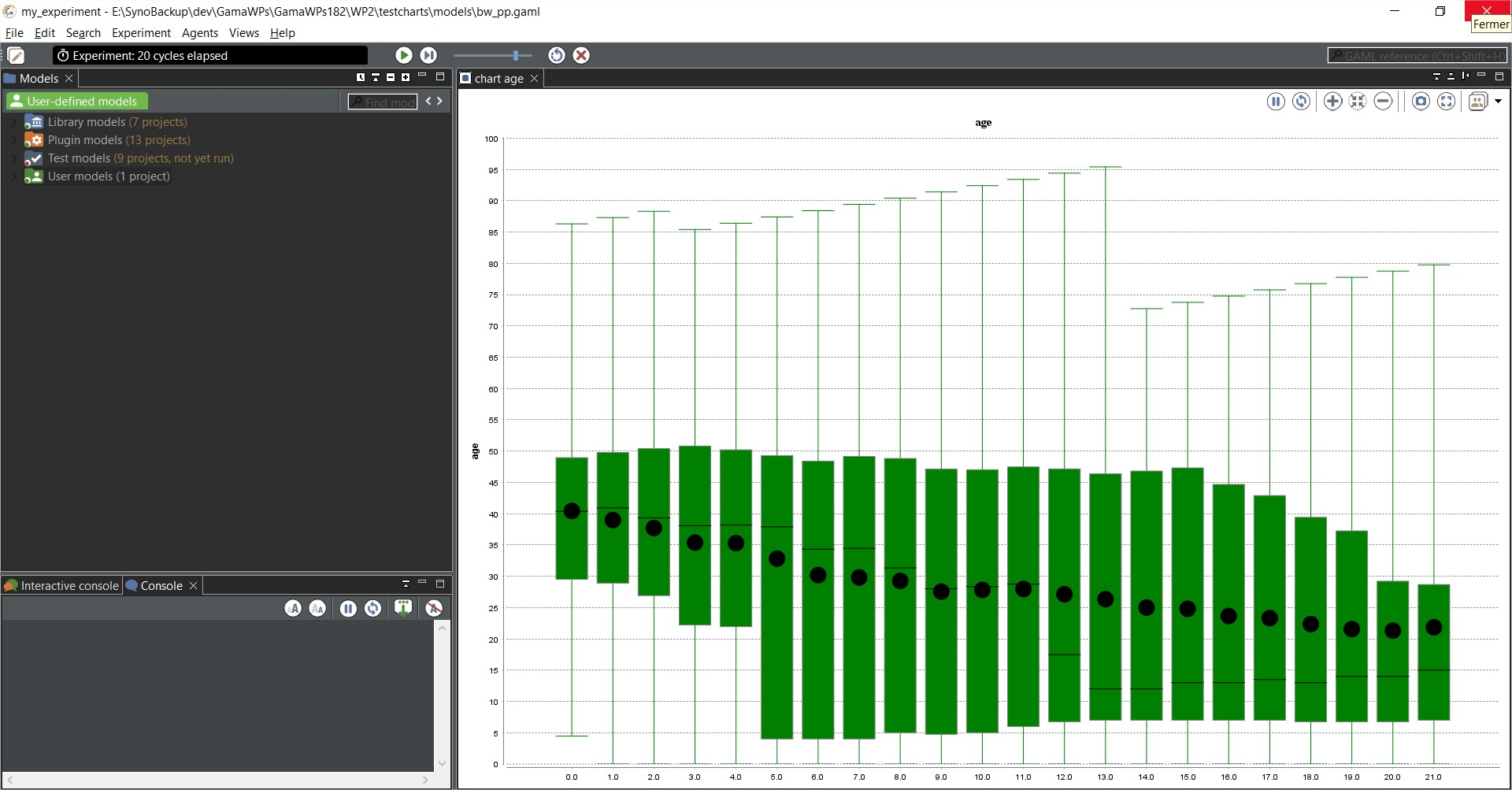
Note that the facet series_label_position (with yaxis value) int the chart statement is used to display the serie label ("age") on the y axis. With more series, we can display the labels as a legend (with the 'legend' value).
Other charts possibilities
The chart, data and datalist come with a huge number of additional facets, allowing you to design advanced result display. We can mention here some of them.
Error values
Just as a box plot, drawing error values around a value, allows the user to visually identify a value (e.g. a mean value) and the distribution of this value around it. The y_err_values facet of data can be used to show in the data plot and a range around it (e.g. the min and max value of an expression in the agent population).
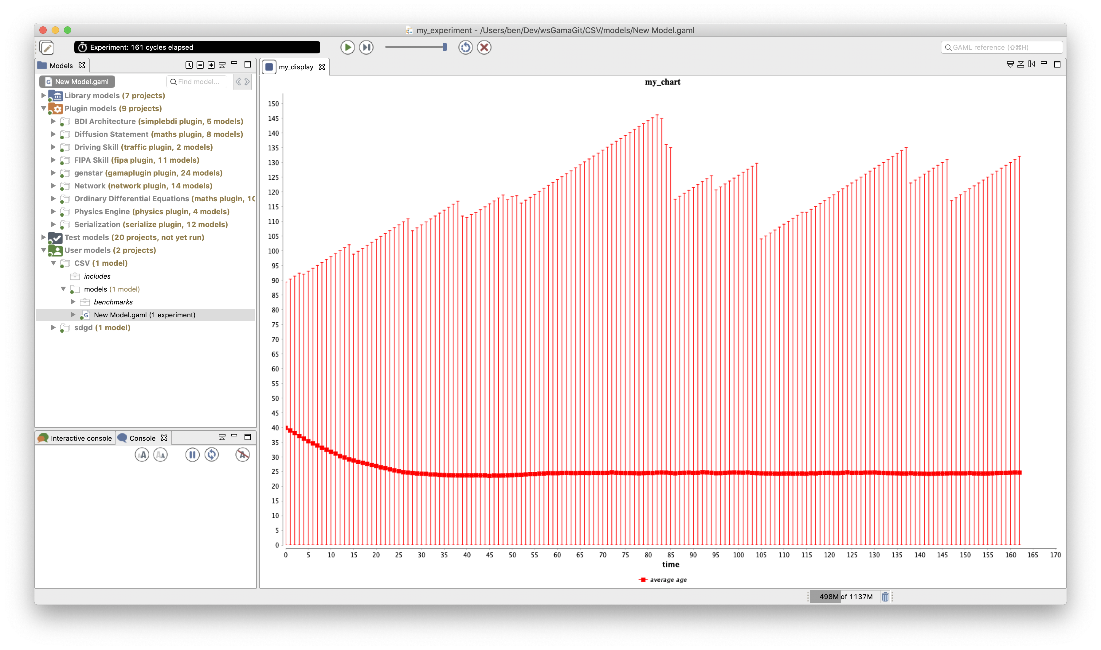
In this example, we plot the average age of agents in the population, with the minimum and maximum value. Here is only the experiment code related to the model shown in the previous parts.
experiment my_experiment type: gui {
    float minimum_cycle_duration <- 0.1;
    output {
	display "my_display" {
	    chart "my_chart" type: series {
		data "average age" value: people mean_of each.age color: #red
                           y_err_values: [people min_of each.age,people max_of each.age];
	    }
	}
    }
}